Power BI Semantic Model Layout
Laying out your semantic model properly helps you remember all its nuances, and lets your team literally see the big picture.
Collin Tsui
7/30/20255 min read
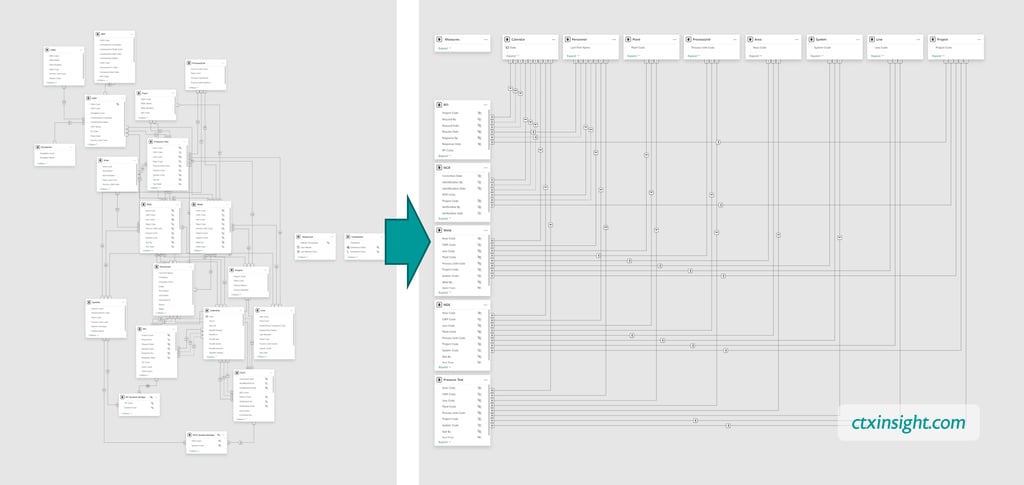
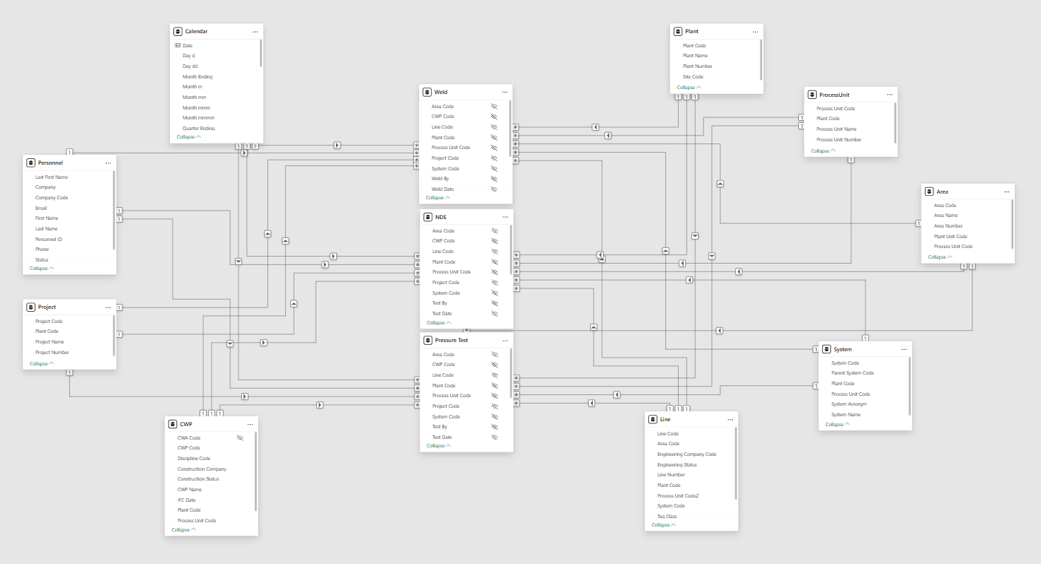
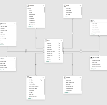
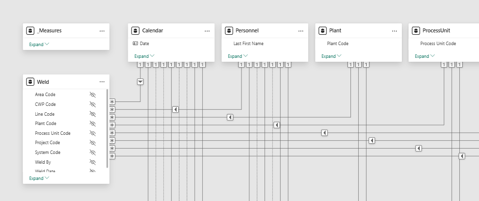
Do you have trouble understanding the structure of a Semantic Model? I don’t know about you, but it would take me a long time to decipher the one on the left. The one on the right looks a lot easier.
If this makes sense right away, skip to the bottom for the advanced bits. Otherwise, read on.
A Little Background
However, as your Power BI dashboard gains more utility, so too does the Semantic Model get more complex. Once you add a couple Fact and Dimension tables and build a few more relationships, the autoroute lines cross (a lot), making it increasingly more difficult to see what goes where.
Like many things in Power BI, the default is okay when you’re just starting out. As you learn about data modeling, you inevitably come across the term “Star Schema”, which implies showing your model like a star, an octopus, or spokes on a bike, with the Fact table in the middle surrounded by Dimension tables. With a simple model, Power BI’s Model View is fairly intuitive, and shows you what you need to know.
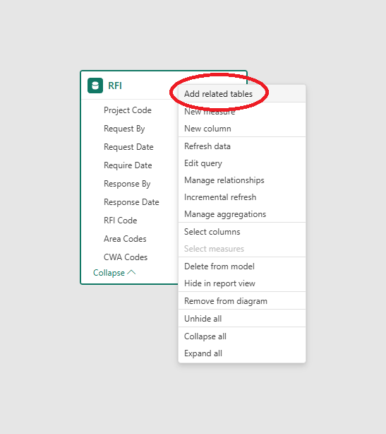
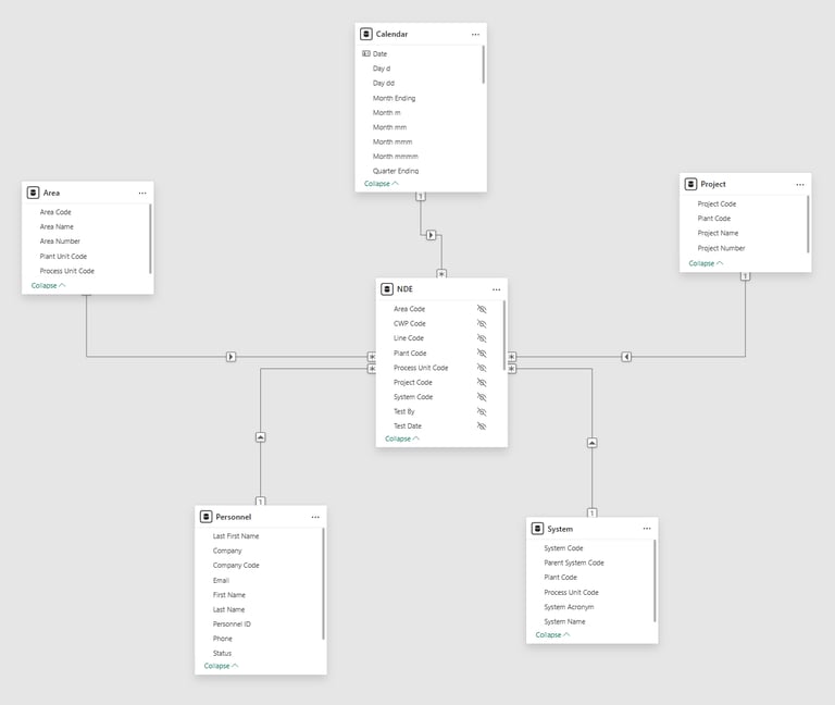
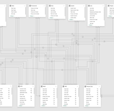
At this point, it can be helpful to isolate each Fact table into its own layout, along with related dimensions. You can do this by creating a blank layout (click the “+” along the bottom of the Model View), drag and drop a Fact table, then right click on it to select “Add related tables.”
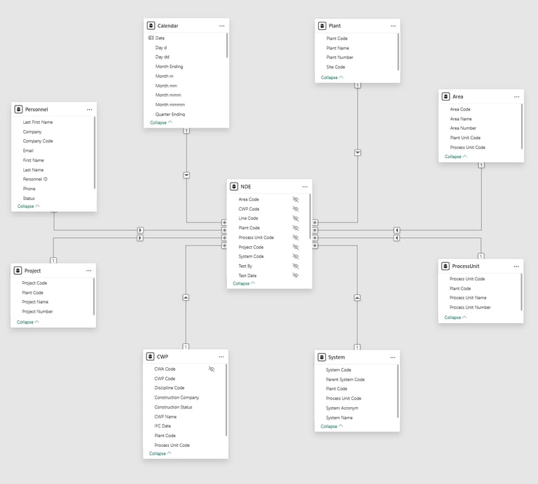
This brings back that simpler view, and allows you verify the Star Schema has been implemented properly (relationship cardinality, cross-filter direction, hidden key columns, etc).
It can even look nice with a little clicking and dragging. What? Why are you looking at me like I have OCD? Focus!
The advantage is you can visually confirm each Fact table follows the Star Schema. The drawback is the effort it takes to do this for each Fact table separately. I ain't got no time for that! (Unless you only have one Fact table, in which case, bookmark this page and come back later).
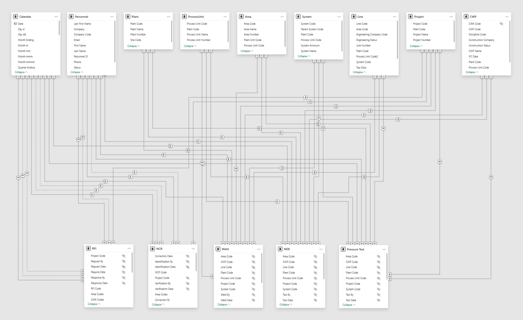
Sometimes though, it’s handy to see everything together. Rob Collie from the OG Power BI dev team came up with an elegant way to do this, commonly called the Waterfall or Collie layout, by lining up all the Dimension tables on top and all the Fact tables on the bottom. It's a drastic improvement, making it much easier to find the Dimension and Facts at a glance.
The New Idea
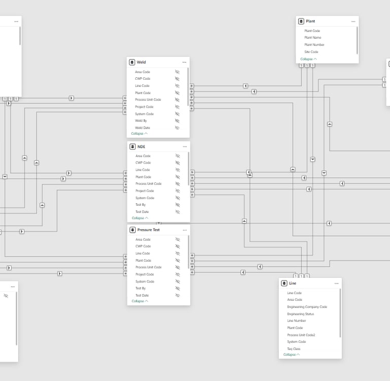
I was still unhappy with how Power BI autoroutes the relationship lines though - sometimes the Waterfall layout does great, sometimes it makes spaghetti - so I kept trying different variations.
At one point, I needed to document a Semantic Model and made a Bus Matrix (the kind pioneered by Kimball for Data Warehousing), like this one to the right.
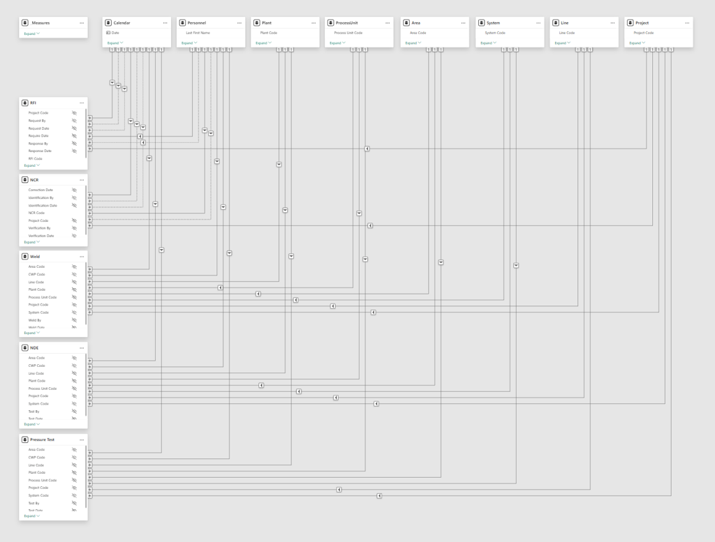
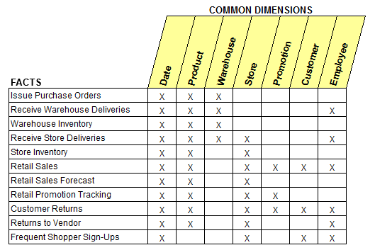
Some say laziness is the mother of all invention. It’s true! I did not want to trace every relationship to build the matrix, so I laid out my model the same way to figure out where all the X’s go. Lo and behold, it actually looked really nice. And thus the Bus layout was born!
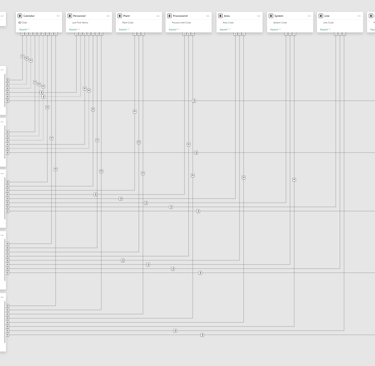
Creating the Bus Layout
Here’s a few quick steps to set up the Bus layout:
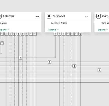
Line up all your Dimension tables along the top. Like, the very top, so they all align perfectly. Your OCD coworker will smile.
Line up all your Fact tables on the left. Like, the very left, so they all align perfectly. Your OCD coworker will thank you.
If you use a Measure table, keep it in the top left corner. See how it aligns with the Dimensions and the Facts? Your OCD coworker will high five you.
Notice how the relationship lines autoroute in a simple L shape? Get ready, because your OCD coworker is about to bear hug you.
The Bus layout makes it really easy to visually confirm your Star Schema is set up properly.
Collapse every table. Only the fields in a relationship will remain visible. There should only be one field for each Dimension.
Check along the bottom of your Dimension tables… they should all be on the “1” side of a relationship.
Check along the right side of your Fact tables… they should all be on the “*” side of a relationship.
Also on the Fact tables, check that your key fields are all be hidden (to encourage selecting the corresponding field from the Dimension table instead).
All the filter directions should point down or to the left. They will be spaced evenly. Your OCD coworker may start tearing up.
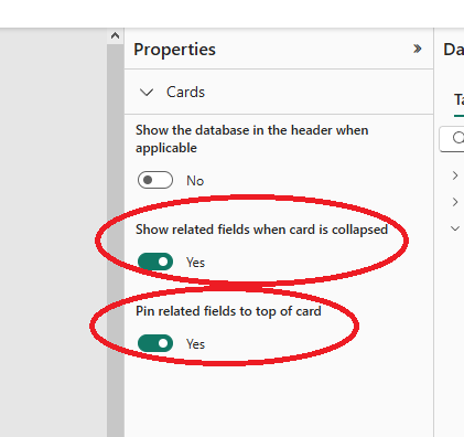
(If any of the above isn’t showing properly, try clicking on an empty part of the layout screen, then select “Yes” to both Showing and Pinning related fields under Properties.)
For Advanced Modelers
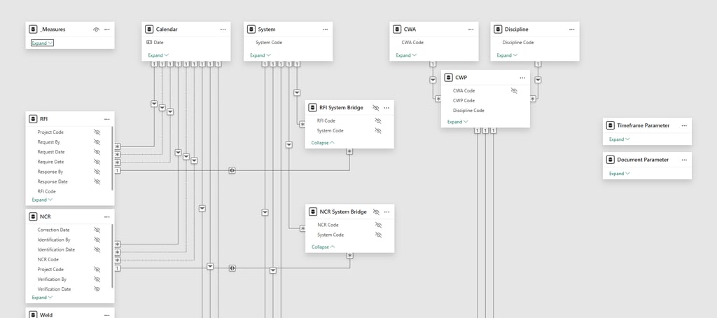
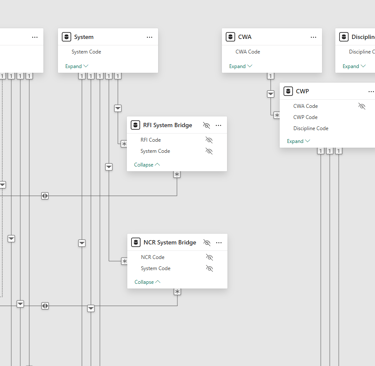
I usually keep any Field Parameters and other disconnected tables off to the right side. For those of you that like swimming in the deep end, the Bus layout can accommodate Bridge tables, too. You can also snowflake, if you’re into that kinda thing (no judgement here! ;-)
Ready to make sense of your data models?
Are your Semantic Models looking like a plate of spaghetti? Trying to figure out the difference between Facts and Dimensions, why a Many-to-Many relationship causes issues, or how to use that inactive relationship? Let’s talk!
I build custom Power BI solutions - simple or complex - that keep projects on time and on budget. Contact me today to see how to untangle your data.